A conceptual editorial design project for Preserve Magazine, a Christian fashion and lifestyle publication centered on faith, culture, and intentional living. Working within an established brand system, I contributed to the visual execution of the magazine’s first editorial release, helping translate the publication’s values into a cohesive print and digital layout experience.
As part of the inaugural issue, the focus was on setting a strong foundation for editorial flow, hierarchy, and visual consistency. The layouts balance elevated fashion imagery with thoughtful typography and structured pacing, supporting both long-form storytelling and visual impact. The result is a refined editorial system that feels modern, intentional, and aligned with Preserve Magazine’s tone across both print and digital formats.
Preserve Magazine
My Role
Contributed to the first editorial publication
Designed the magazine cover and three interior editorial spreads
Applied existing brand guidelines to maintain visual consistency
Helped establish editorial flow, pacing, and layout structure
Executed copy placement, typography systems, and photo composition
Prepared layouts for both print and digital formats using Adobe InDesign
Cover
This cover was created as an alternate visual direction for the issue, exploring a more minimal, editorial-forward approach within Preserve Magazine’s brand system. The design leans into thoughtful typography and image balance, setting a calm yet confident tone. While a different direction was ultimately selected, this concept reflects my approach to creating covers that feel elevated, timeless, and rooted in the publication’s identity.
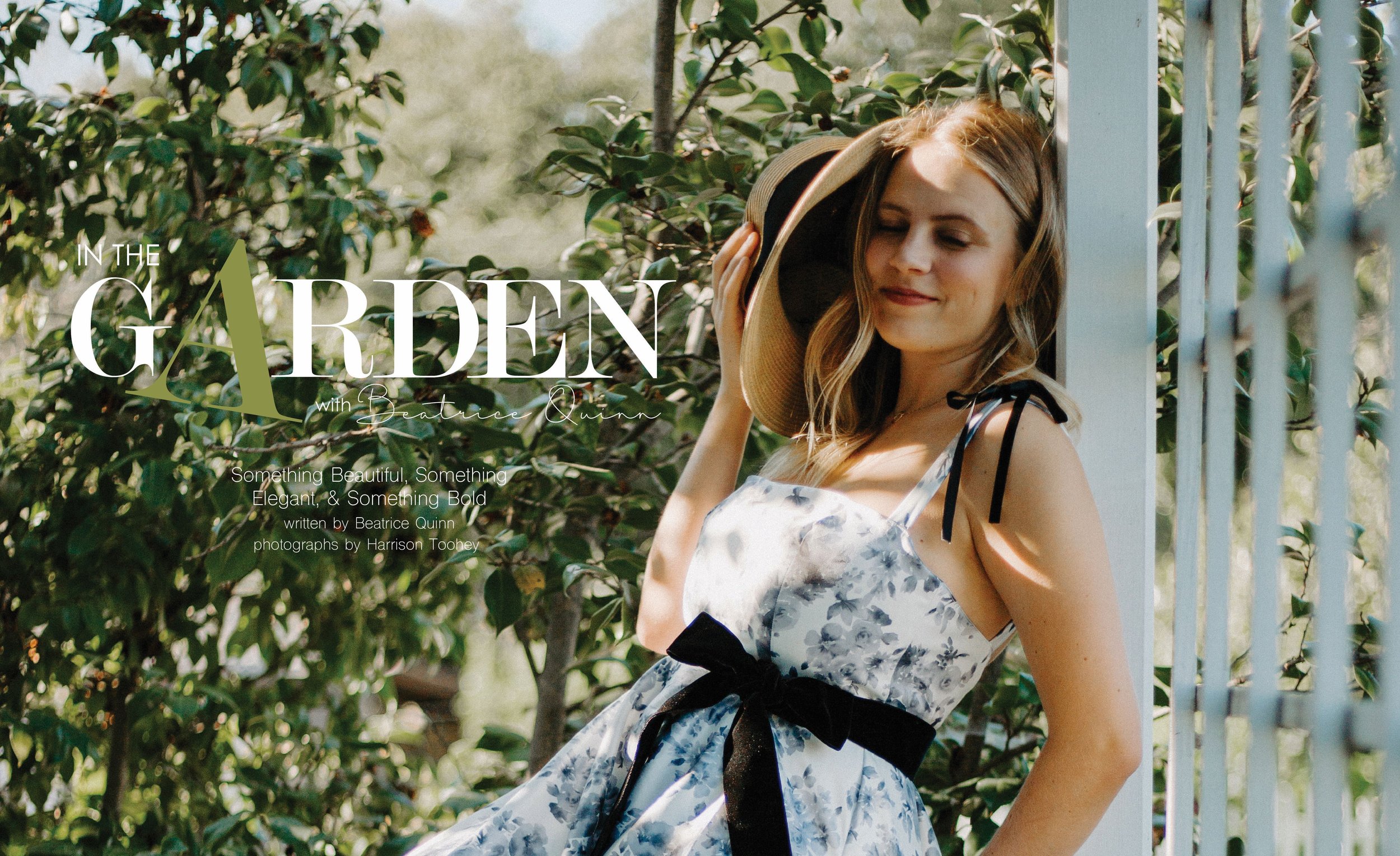
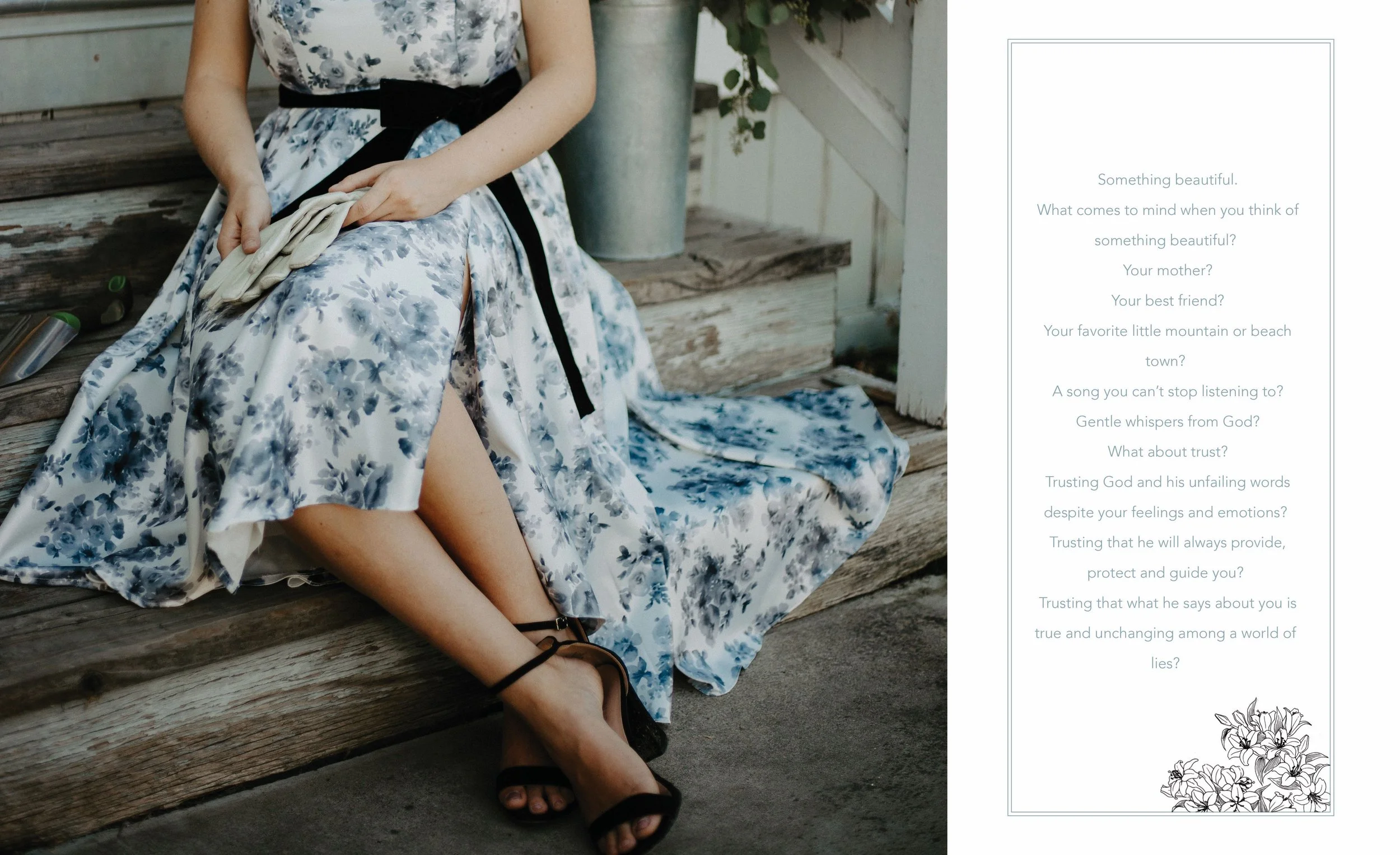
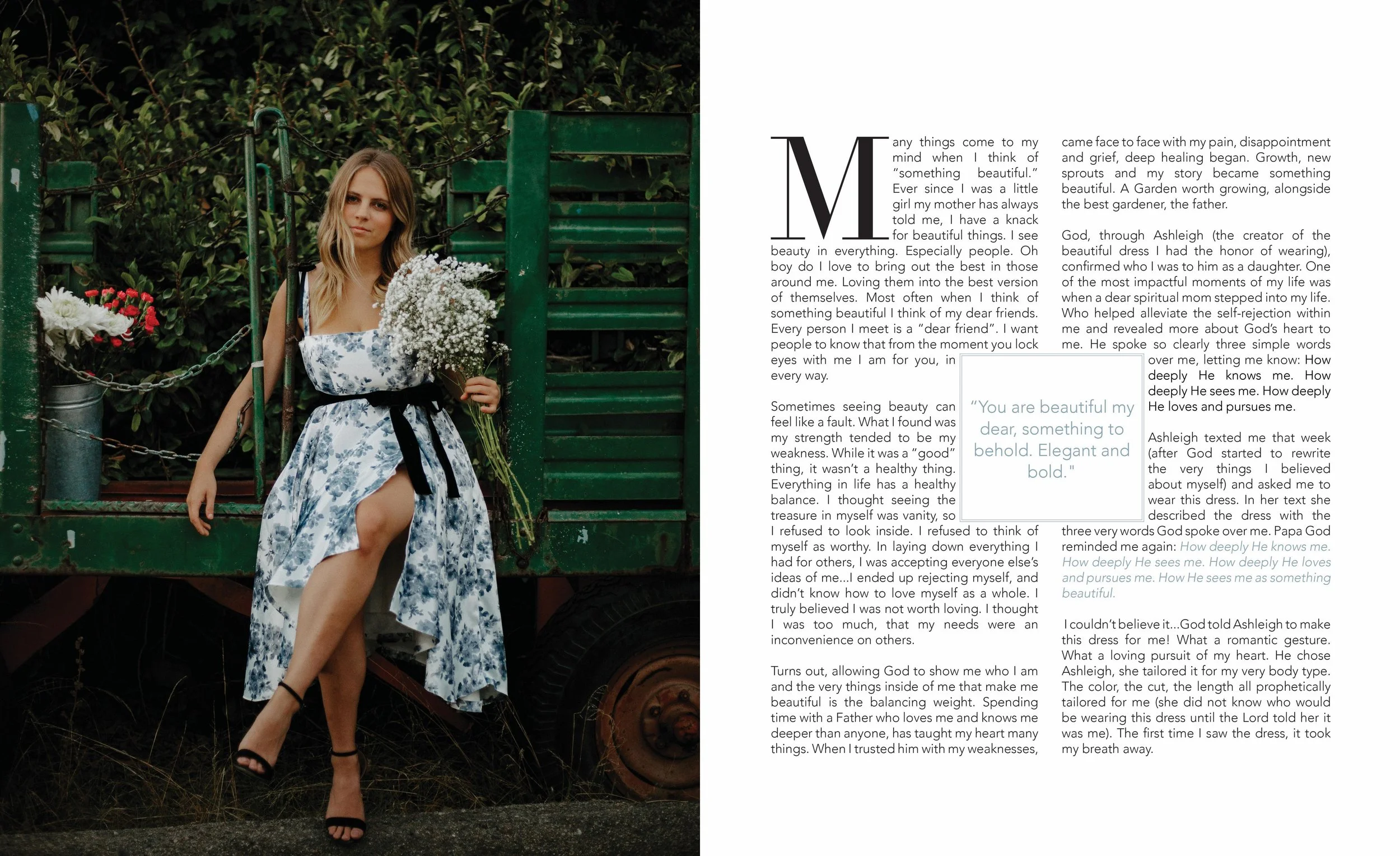
In the Garden
This spread leans into simplicity—soft imagery, thoughtful spacing, and a restrained typographic system. The layout was designed to feel natural and unforced, letting the content breathe while maintaining a clear editorial structure.
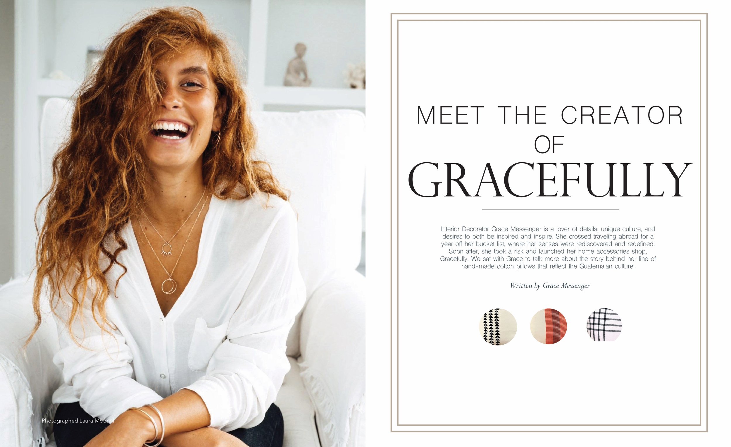
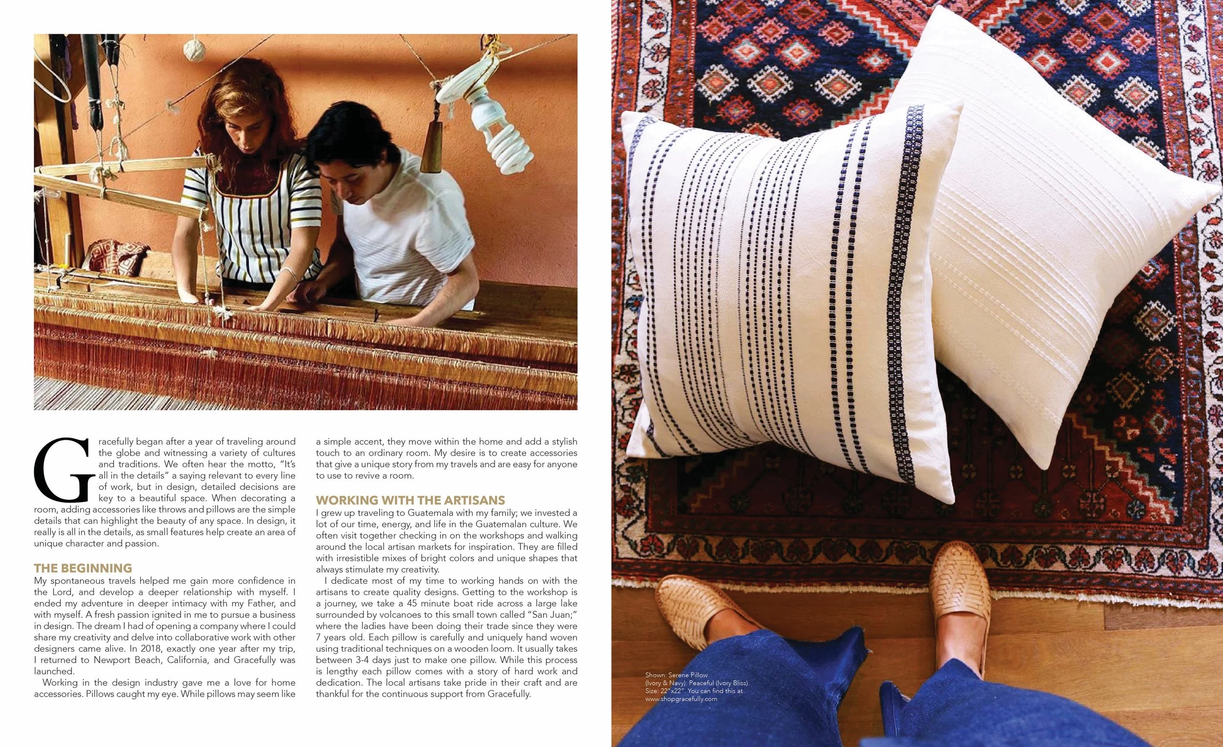
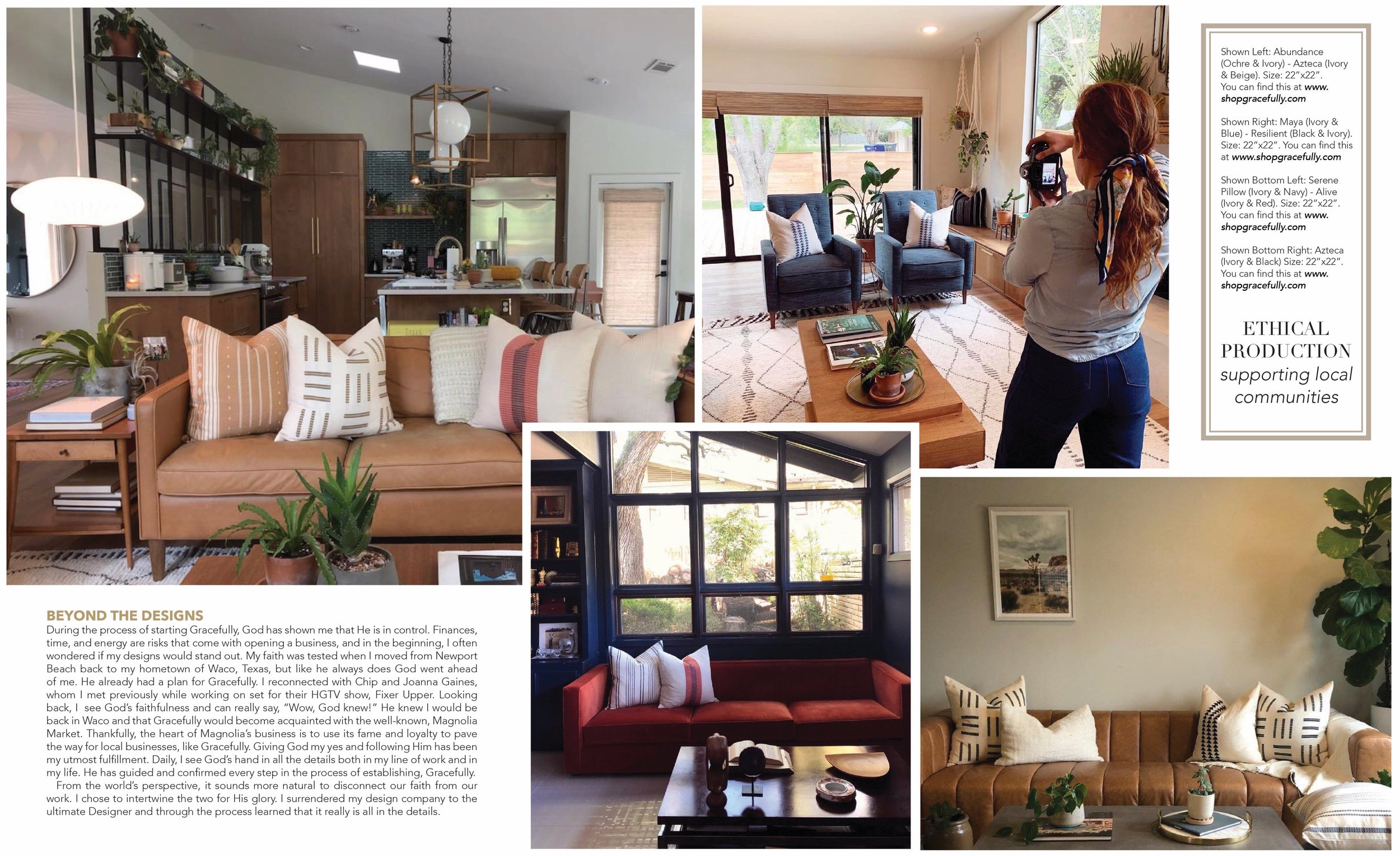
Meet the Creator of Gracefully
This spread centers on the person behind the brand, blending structured layouts with moments of visual interest. The design guides readers through the narrative while keeping the subject front and center, creating a balance between storytelling and editorial polish.
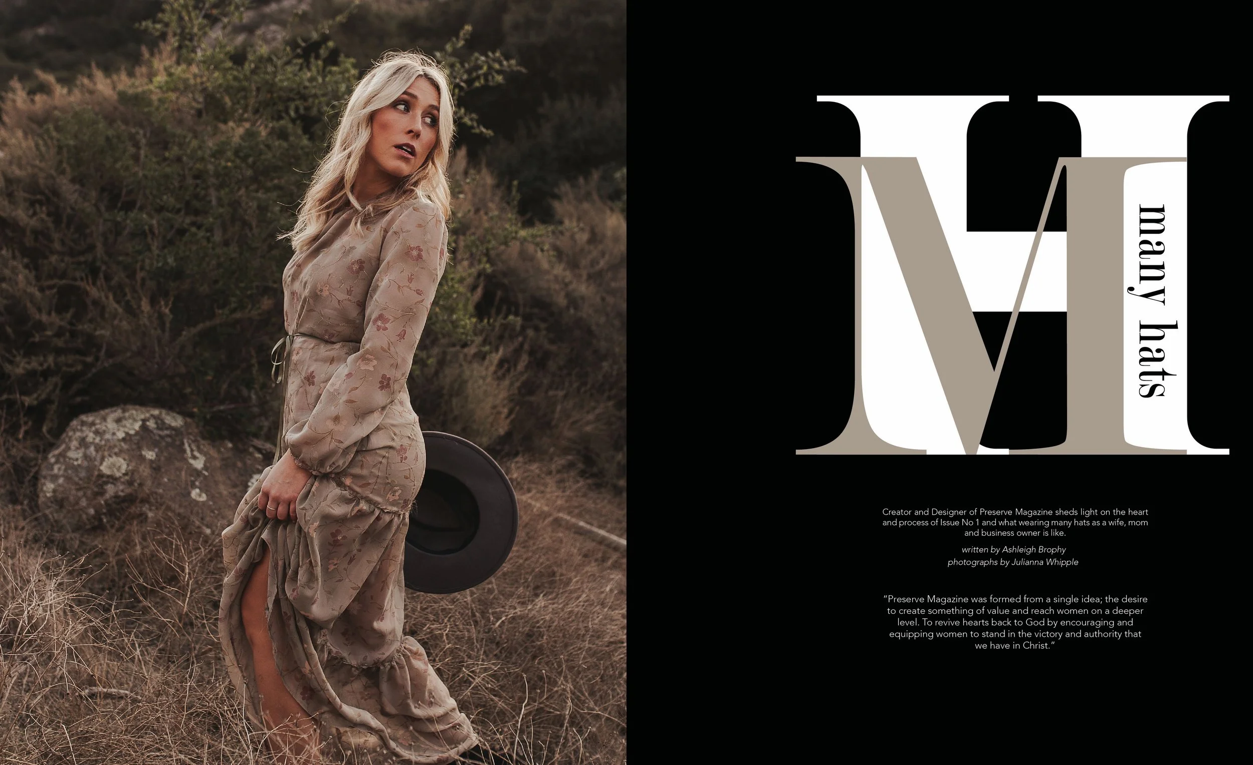
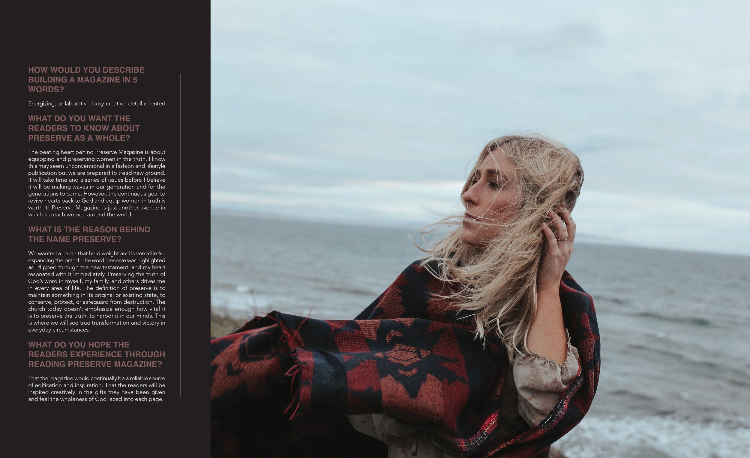
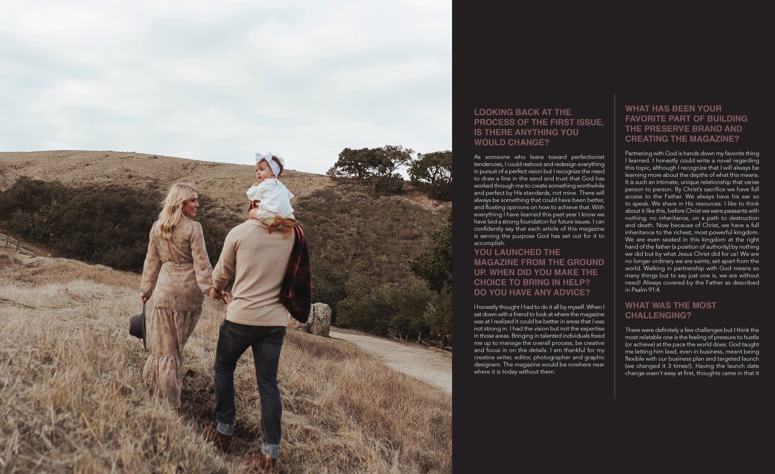
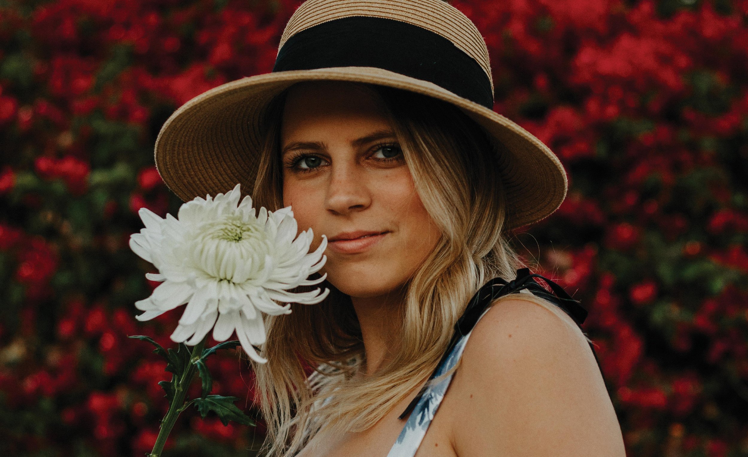
Many Hats
This interview-led spread explores the layered realities of building a creative brand; balancing vision, faith, family, and leadership. The imagery sets an intimate, reflective tone, while the structured Q&A layout provides clarity and rhythm. Thoughtful typography and restrained color choices allow the subject’s voice to lead, creating space for honesty, vulnerability, and growth behind the brand.